You may have heard that Google has recently updated their organic search algorithm. This is nothing new and their algorithm is in a near constant state of refinement and change.
What is notable though, is that a major update at Google on April 21, 2015 has likely penalized your business search rankings if you don’t have a mobile optimized web site. This change could have major search ranking impacts if you’re not prepared. If you’re not sure if you’ve prepared for this change then it’s likely you are not. Don’t fear, we’ll help you determine if it’s time to make some changes.
The key to understanding if you have work to do is knowing the difference between a “Mobile” site and a “Responsive” site.
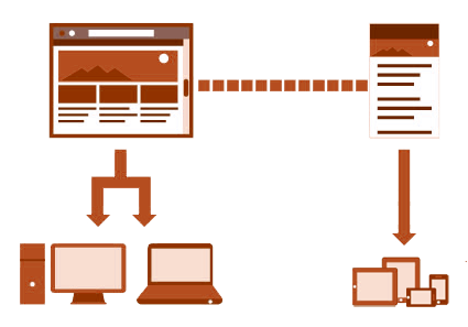
Mobile – Two Designs: Two Devices

Mobile sites are not considered a recently new invention. For years now, and since the onset of smart phones and tablets, we’ve seen mobile friendly web sites. Most often it is simply the same website but a second version of the design with some modifications to make some fixed layout changes so that the navigation, artwork and content is more digestible on a small smart device screen.
Typically, the browser notes that you are using a smart device and the web site loads the second design of the site on a sub-domain of the main site like “m.yourwebsite.com.” This is a “one size fits all” approach to providing a web site on a smart device and is meant to eliminate the pinch-zoom style of web surfing that plagued smart devices in the beginning.
Technically this has worked well in the past, but as content is becoming more engaging and complex now there is something better: Responsive site design.
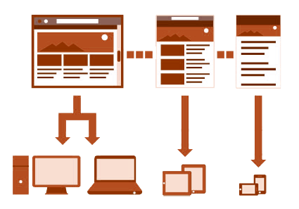
Responsive – One Design: Many Devices
 Responsive site design is exactly that. Instead of a second version of the web site with fixed navigational, artwork and content changes for smart devices, Responsive design responds to the size of the screen dynamically.
On screen elements resize, rearrange , appear and disappear depending on the resolution of the device. In this way, the web site is optimized on the fly for virtually every screen size, big or small ensuring the best user experience every time. This is more of a “custom fit” approach to displaying your web site on all screen sizes from desktop to smart phones.
Odds are you’ve been using responsive web sites for a while now and didn’t even notice because the content is what kept your attention, not how unruly the design was to use. Moving forward this is how web design will be implemented and Google has been silently watching this trend unfold.
Google – Relevancy and Accessibility
Google is most interested in delivering relavant and easily accessable content. It’s not enough to just deliver great content. You need to do it in a way that ever user will find straightforward. That’s where Responsive design comes in and why Google places such a high premium on sites that offer it. All things considered, if two site score the same for content but only one site is responsive, then Google will likely favor that site when it comes to search rankings.
To learn more about what Google has to say about it’s recent algorithm updates, Responsive design and to test your site for “mobile friendliness” go to Google’s article on this.
You
If you find that your site is not mobile friendly, then don’t worry. We’re here to help answer any questions. Give us a call and we’ll be glad to help you along the road to a Responsive web site.
